

Why Planning Your Website’s Design Matters More Than You Think
A well-planned website is more than good design. Learn why sitemaps, positioning, UX and UI, copy, mockups and timelines all matter — and how Fort Hartley does it right using Avada.
Categories:
Date Posted:
July 30, 2025

Building a website that works starts with proper planning
When it comes to building a website that actually works for your business, the planning phase is everything. At Fort Hartley, we’ve seen it time and again, brands that rush into design without a clear strategy end up with websites that look decent, but don’t perform. Planning your website’s design sets the foundation for success, from the sitemap and copywriting to the graphic design and user experience.

Start with a Sitemap: Know Where You’re Going
Before a single pixel is pushed or headline is written, we always start with a sitemap. This isn’t just a technical document, it’s the backbone of your entire website. It is a clear, visual map showing how each page connects, what content belongs where, and how your visitors will move through the site.
Think of it like planning a shopping centre. You wouldn’t just build stores randomly and hope people find what they’re looking for. You would group similar shops together, create logical walkways, place anchor tenants where they get traffic, and guide customers from entrance to checkout with intention. A sitemap does exactly the same for your website.
A well-structured sitemap ensures that the information architecture makes sense for your business and your audience. It helps you identify key touchpoints like product pages, service overviews, testimonials, FAQs, and contact forms. It also lets you consider the flow. Do users arrive on your home page and then go to your About section? Or do they land straight on a service page from Google and need a clear path to contact you?
A Real Example:
Let’s say you’re a Johannesburg-based wellness brand. Your sitemap might include:
- Home
- About Us
- Services (with subpages for Corporate Wellness, Retreats, and Online Coaching)
- Testimonials
- Blog
- Contact
But what if you also run events? Should that sit under Services or get its own section? What if your online store is growing? Should you integrate eCommerce now or later?
These are the types of questions a sitemap helps us answer before any design or copywriting starts. It gives us the opportunity to plan for growth, manage user expectations, and avoid major revisions later down the line.
Why It Matters
Sitemaps also give you clarity. They help you spot gaps in your messaging and content before you commit to anything visually. For example, many clients realise at this stage that they need to develop more case studies or simplify their service offering. Others see the value of including downloadable resources or lead magnets to support their sales funnel.
Lastly, having a sitemap upfront makes the entire project more efficient. Our copywriters know exactly what to write. Our designers understand the structure they’re designing for. And our developers can start planning functionality early on. It is like having a building plan before laying bricks, and at Fort Hartley, we don’t build without one.

Brand Positioning Drives Everything
Design doesn’t happen in a vacuum. It’s not just about picking colours you like or adding trendy icons. To create a website that actually connects with the right people, we need to know exactly who your brand is, what it stands for, and who it is speaking to. That’s why brand positioning is so important and is the place to start before you embark on the website building journey.
Your positioning defines how your brand fits into the larger market and then how it is going to be perceived by your target audience. Positioning will guide decisions around everything from language and tone of voice, to design, layout, calls-to-action and even how your services are presented.
Ask the Right Questions
- Before we start designing, we ask questions like:
- Are you a premium brand or budget-friendly?
- Are you bold, fun and playful, or more elegant, serious and minimal?
- Do you want to appeal to corporates, creative professionals, local communities or niche markets?
- What makes you different from your competitors?
- What do your customers value most: price, quality, speed, social impact?
The answers shape the entire direction of the website. For example, a high-end legal consultancy will need a completely different approach to a youth-focused fashion brand. The colours, layout, typography, content length and even the homepage headline will change based on what the brand stands for.
Why It Matters
Without clear positioning, websites tend to feel flat or generic. You might end up trying to appeal to everyone, and in doing so, connect with no one. We often see businesses that have great products or services, but their website doesn’t reflect their value. That gap is usually due to a lack of defined brand positioning.
At Fort Hartley, we take the time to understand your positioning upfront. If you already have brand guidelines, we build on them. If you don’t, we help you define your space in the market. This becomes the foundation for every design decision that follows.
A Simple Example
Let’s say you’re a Cape Town-based boutique hotel. If your positioning is “affordable comfort for young travellers,” your site might feature bright colours, casual copy, mobile-first design and direct booking buttons. If your positioning is “exclusive luxury for international guests,” we’ll shift to a minimal colour palette, elegant serif fonts, high-end photography and strong storytelling.
The same service, completely different design outcomes based on positioning.
Bringing Positioning into Design
Once we know your brand’s unique space, we apply it consistently across the site. We choose design elements and language that reinforce that identity. Your forms, your blog tone, your testimonials, your pricing page. Everything works together to attract and convert your ideal customer.
This clarity also helps with future updates and campaigns. Your website becomes a long-term asset that always reflects your brand accurately, rather than something you need to rebuild every year because it no longer feels right.
UX and UI: More Than Just Buzzwords
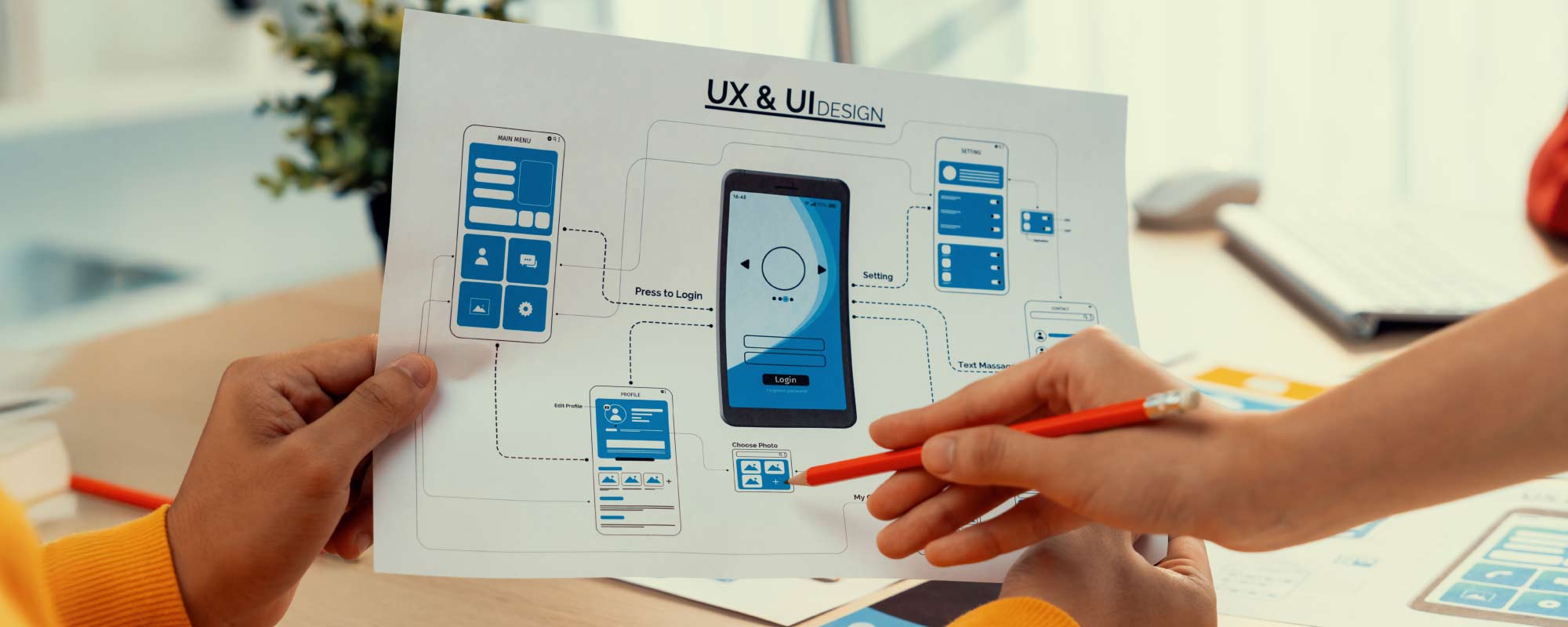
UX (User Experience) and UI (User Interface) are not just trendy techie terms tossed around in agency meetings. They are essential ingredients in building a website that not only looks great but actually works for the people using it.
UX is about how easy, intuitive and enjoyable your site is to navigate. It covers everything from how quickly someone can find the information they need, to whether they feel confident enough to fill in your contact form. UI, on the other hand, is about how your website looks and behaves visually. This includes your colours, fonts, buttons, icons, layout and visual hierarchy.
At Fort Hartley, we give both equal attention because they are deeply connected. You cannot have a beautiful website with poor usability and expect results. And you cannot have a highly functional site that looks outdated or cluttered and still expect users to trust your brand.
UX: Designed for Real People
User experience is the heart of every website we build. We put ourselves in the shoes of your customer and ask, “What do they need to do here?” Then we make that path as simple and clear as possible. This might mean adding an obvious call-to-action on every page, reducing unnecessary clicks, improving loading speed or simplifying a complicated service flow.
For example, if your business offers multiple packages, a good UX approach might include a comparison table, easy navigation tabs or interactive filters so visitors can make a choice quickly and confidently.
We also look at things like mobile responsiveness, content structure and accessibility. If someone has to pinch and zoom, scroll endlessly or try to figure out what button does what, they are likely to give up. A good user experience removes all those barriers.
UI: Visuals That Work
User interface design is what brings the experience to life visually. A clean, consistent and professional look builds trust and sets the tone. It also gives your brand personality. Whether you want your site to feel playful, bold, classic or calming, we reflect that in the UI.
We pay attention to spacing, alignment, button shapes, contrast, and font pairings. Every detail matters because your site’s design creates a first impression long before someone reads a word of copy.
Think of a website as a digital shopfront. If the layout is messy, the signage is confusing and the lighting is harsh, you are going to walk right past. If it feels welcoming, polished and easy to navigate, you’re more likely to step inside and stay.
Built Around Your Goals
UX and UI also tie directly into your business goals. Want more enquiries? We make sure your forms are easy to find and quick to fill out. Want people to download a brochure? We design the journey so it leads them to that action naturally. Every decision is based on user intent and how to guide them toward what you want them to do.
We don’t just aim to build pretty web pages. We construct websites that convert, delight and perform. Because if your site is frustrating to use, doesn’t use the right language or has no tie in to your larger brand message. It won’t matter how good it looks. People will leave, and they often won’t come back.
Mockups, Approvals and Iterations
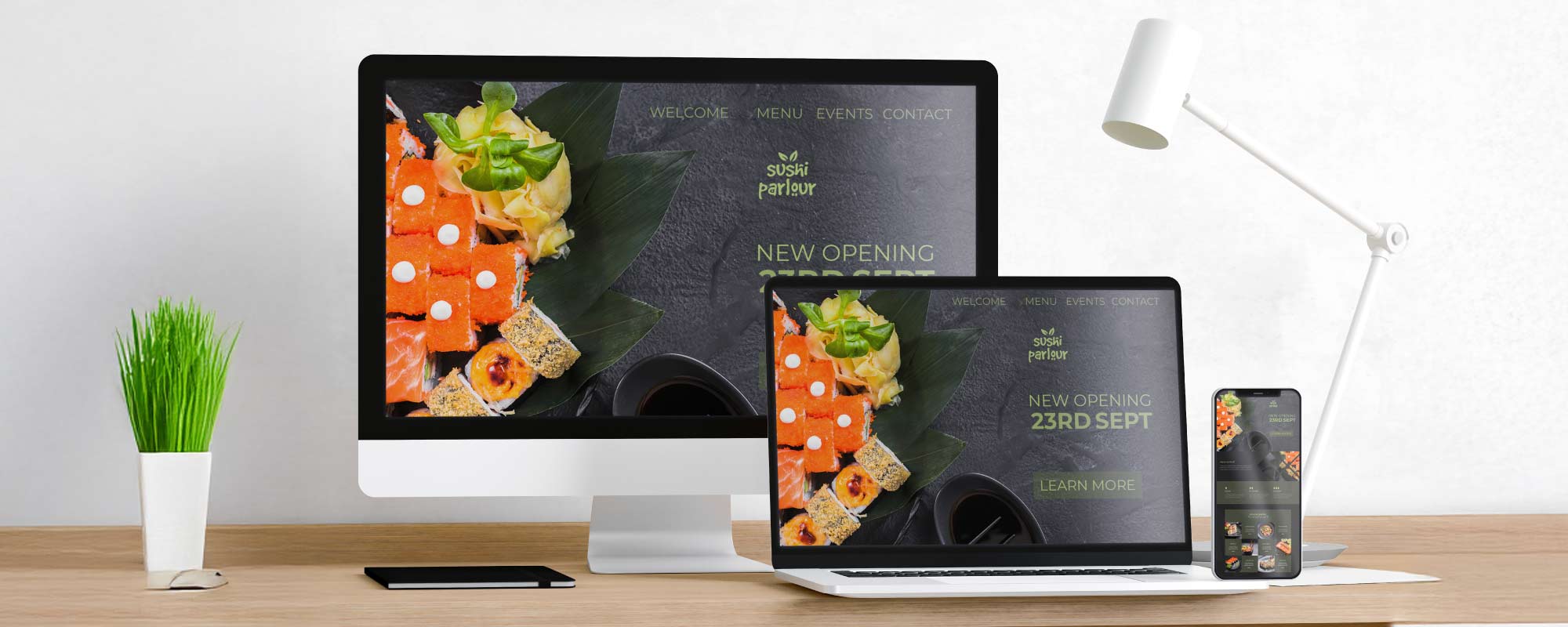
This is the part where things start to look real. Once we’ve got the sitemap and brand positioning sorted, it’s time to bring the website to life on screen. We create mockups, which are basically design previews of your key pages. Think of them as stylish blueprints that show you what your future site will look like, before we dive into the techy build stuff.
Mockups let you see the layout, colours, fonts, images and content all coming together. It’s your chance to go, “Yes, this feels like us,” or “Hmm, let’s move that button over there.” No code has been written yet, so changes are quick and easy.
Why We Love Mockups
Mockups are magic because they take all the ideas we’ve been chatting about and turn them into something visual. You can see how your homepage might welcome users, how your service pages are laid out, and where your contact form fits in. You get a proper feel for the look and flow of the site, not just words and wireframes.
It also helps spot things early and avoids the great wasting of precious time. Maybe your brand colours feel too heavy on a white background, or maybe the headline needs more space to breathe. Better to catch it now than during development when changes take longer and cost more.
The Approval Process
Once we’ve put together the mockups, we send them your way and walk you through them. This is where we invite honest feedback, ideas, tweaks and even the occasional “Can we try something a bit different here?” We’re all for collaboration, and this is the perfect time to get involved.
You give us your feedback, we polish things up, and once you’re happy, we lock it in and get ready to build. No surprises later, just a solid, approved design that everyone’s proud of.
Save Time. Save Money. Keep Things Smooth.
Skipping mockups is like skipping the dress rehearsal before opening night. You might get away with it, but you’re risking a lot. By working through mockups first, we avoid big changes during development, cut down on unnecessary delays, and keep the whole project moving forward smoothly.
Plus, mockups help everyone stay aligned. Designers know what they’re aiming for. Developers know exactly what to build. And you know exactly what’s coming.
Peace of Mind, One Page at a Time
Mockups give you the confidence that your site is headed in the right direction. It’s like seeing your house before the bricks are laid. You can make sure everything’s in the right place and looking sharp before anyone picks up a hammer.
So yes, we’re big fans of mockups. They’re fun, creative, practical, and they save the day more often than not.

Set Timelines and Stick to Them
Let’s be honest, without a clear timeline, a website project can feel like a never-ending group assignment. One minute you’re making great progress, and the next thing you know, two months have flown by and you’re still stuck in feedback limbo. That’s why we believe in timelines. Proper ones. With real dates, clear phases, and a plan that everyone can follow.
From day one, we map out the full journey. That includes planning, mockups, copywriting, development, content loading, testing and finally, the big launch. We don’t just throw out ballpark weeks either. We give you a proper project schedule, with time built in for reviews, feedback rounds and content handovers.
Everyone’s in the Loop
When you know what’s happening and when, the whole process feels smoother. You’re not chasing updates or wondering who’s doing what. Our team knows what we’re working on, your team knows when we need input, and there’s less chance of missed deadlines or rushed decisions.
We also flag potential bottlenecks early. Need more time for photos? Waiting on product info? No problem. We adjust timelines together, keeping the project moving forward without turning it into a panic party.
Why It Matters
Timelines keep the project focused and energised. They help us avoid last-minute stress, scope creep and version 17 of a homepage that should have been live weeks ago. With clear expectations, everyone is more committed, more accountable and more excited to see the site go live.
A great website doesn’t happen overnight, but with a solid timeline and a team that sticks to it, it definitely doesn’t need to drag on forever either.
Don’t Forget the Copy
You can have the most stunning website design in the world, but if the words on the page don’t land, your visitors will scroll away without a second thought. Copywriting is not just about filling space. It is about shaping your brand voice, guiding user behaviour, and turning browsers into buyers.
At Fort Hartley, we treat copy as one of the most powerful tools in the website toolkit. Every headline, sentence, button label and footer message has a job to do. Whether it is building trust, telling your story or getting someone to click “Enquire now,” the right words make all the difference.
Tone, Cadence and Personality
Great copy doesn’t just inform. It connects. The tone of your website should feel like your brand is speaking directly to the user. Warm and chatty? Sharp and professional? Bold and energetic? Whatever your personality, the copy needs to match it.
Cadence also plays a big role. That is the rhythm of how your content flows. Short punchy sentences can build excitement or urgency. Longer, more descriptive lines can slow things down and bring a sense of calm or trust. We balance both to suit the mood you want to create.
This tone and cadence guide how people feel about your business. If your brand is all about innovation, your copy should feel fresh, confident and forward-thinking. If your business is based on personal relationships, the words should feel human, helpful and reassuring.
We Can Work With What You Have. Or Start From Scratch
Some clients come to us with a full set of content ready to go. Others know what they want to say, but aren’t sure how to say it clearly. And some are starting from a blank page. No problem either way.
We can take your existing copy and refine it, rework it, or expand on it to make sure it hits the mark. Or, we can write everything from scratch based on your brand, goals and customer needs. We’ll ask the right questions, get to know your voice, and deliver content that actually works on the web.
Copy That Converts
Good copy builds trust, creates clarity, and gives people a reason to act. Whether that means booking a demo, joining your newsletter, or calling your team for a quote, the words on your site must lead people toward that action.
It also helps with SEO. Well-written content that includes the right keywords, without sounding robotic or forced, can help you get found on Google while still sounding human and on-brand.
Design and Copy Work Together
Design catches attention. Copy keeps it. When the two work in harmony, your message is more powerful. We make sure your words have the space to shine, your headlines punch through the noise, and your calls to action are impossible to ignore.
So yes, design matters. But without copy that’s clear, compelling and aligned with your brand, it’s only half the picture. Never underestimate the power of the right words, in the right place, at the right time.
Design That Speaks: Graphic Elements Matter
Good design isn’t just about making your website look nice. It’s about telling your brand’s story without even saying a word. Every icon, photo, button and font choice plays a part in how people see and experience your business online.
At Fort Hartley, we believe that design should feel natural, intentional and true to your brand. Those small visual details work together to guide your users, support your message and make your site feel like home.
Little Things That Make a Big Difference
Design details matter more than you might think. Rounded buttons feel friendlier. Clean icons make your services easier to understand. A carefully chosen font can give your site a sense of trust, fun, luxury or calm. These are the touches that help people connect with your brand on an emotional level.
We make sure everything is consistent from page to page so nothing feels out of place. When the colours, spacing and visuals all speak the same language, your site feels more polished and professional. That builds trust and helps users stay focused on what matters.
Design Sends a Message
The way your website looks says a lot before anyone reads a single line of text. A bold, colourful layout might tell visitors that your brand is full of energy. A more neutral and minimal look might say you’re professional, thoughtful and all about quality. Every choice makes an impression.
We think of graphic design as the personality of your site. It’s like body language for your brand. If your visuals and your words don’t match, visitors can get confused or lose interest. But when everything lines up, your message lands with impact.
Make Visitors Feel Something
Good design helps people feel confident and comfortable on your site. It makes things easy to find, encourages clicks in the right places and keeps the experience smooth and enjoyable. Whether that’s through a friendly call-to-action button, a scrollable image gallery or a helpful visual explainer, design should make things feel simple.
The goal is to help users take the next step, whether that’s booking, enquiring or just sticking around to learn more. Design makes that possible by making your site not just usable, but memorable.
It’s All About Fit
We don’t just chase trends or throw in flashy visuals for the sake of it. We design around your goals, your audience and your message. If your brand is creative and vibrant, we’ll show that in the visuals. If it’s more premium and sleek, the design will reflect that too.
At the end of the day, graphic elements are how your brand shows up in the digital world. They should feel like you and work hard to support your message.

It’s All in the Planning
At Fort Hartley, we’ve learned that the success of any website project comes down to one thing, solid planning. Without it, projects tend to stall, frustrations start to creep in, and both sides end up spending more time on back-and-forth than on actually building the site.
That’s why we put a strong focus on strategy, structure and clear collaboration from day one. From your sitemap to your copy, from mockups to the final launch, every step is carefully mapped out with your brand goals in mind.
Why Planning Makes the Difference
Good planning saves time, money and a whole lot of stress. It gives the project a clear roadmap, with milestones everyone understands. You know what’s coming next, we know what to deliver, and no one’s left wondering where things stand.
But it’s not just about ticking boxes. It’s about making decisions at the right time and sticking to them. That’s where proper stakeholder involvement comes in.
Get Everyone in the Room Early
One of the best ways to keep things on track is to involve all key stakeholders upfront. Whether it’s your marketing manager, founder, content lead or product head, having everyone at the table early means we can hear all the priorities and align on the direction.
When those conversations happen too late, it often leads to conflicting feedback, last-minute changes and extra rounds of revisions that could have been avoided. It slows down the project and creates unnecessary pressure on both sides.
By bringing everyone together at the beginning (whether in a discovery meeting, workshop or kickoff session) we get clarity. We confirm what’s important, what’s out of scope, and what decisions are final. This lets us design and build with confidence.
Make a Call and Move Forward
Once a decision is made, we believe in closing the door and moving on. That doesn’t mean you can’t give feedback later, but it does mean we avoid circling back to things that were already agreed on. This keeps momentum going and helps everyone stay focused on the end goal.
Too many projects get stuck in an endless loop of “Let’s revisit this one more time,” which only delays launch and adds frustration. A well-planned process lets you make informed decisions, document them clearly, and stick to them.
Planning Builds Trust
When we take the time to plan properly, it sets the tone for the whole project. You feel informed and empowered. We feel aligned and ready to deliver. There’s mutual trust, less guesswork and fewer surprises.
It also means that when unexpected things come up (and they sometimes do) we have a strong foundation to fall back on. With a clear plan and a shared understanding, we can adapt quickly and keep things moving without panic.
A Website That Actually Performs
In the end, planning is not about being rigid. It’s about creating structure that allows creativity, problem-solving and strong results. Your website should not only look great, it should perform. It should reflect your brand, speak to your audience and support your business goals. And that only happens when there’s a well-thought-out plan behind it.